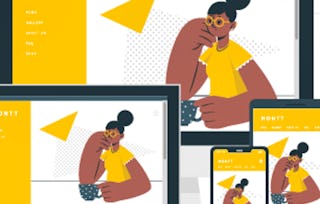
University of Washington
Creating Responsive Websites for Any Device
University of Washington

Creating Responsive Websites for Any Device

Included with Coursera Plus

Gain insight into a topic and learn the fundamentals.
Beginner level

Recommended experience

1 week to complete
at 10 hours a week
Flexible schedule
Learn at your own pace
Gain insight into a topic and learn the fundamentals.
Beginner level

Recommended experience

1 week to complete
at 10 hours a week
Flexible schedule
Learn at your own pace

What you'll learn

  • By the end, you’ll have the skills to create a polished, multi-page website that looks professional and performs well on any screen.

Details to know

Shareable certificate

Add to your LinkedIn profile

Recently updated!

July 2025

Assessments

12 assignments

Taught in English

See how employees at top companies are mastering in-demand skills

 logos of Petrobras, TATA, Danone, Capgemini, P&G and L'Oreal

There are 4 modules in this course

In this module, you will learn how to create responsive and visually appealing web layouts using Flexbox and CSS Grid. You’ll start by understanding the basics of Flexbox, a powerful layout tool that allows you to control the placement and alignment of elements on a web page. You’ll explore various Flexbox properties, such as flex direction, flex wrap, and justify content, to create flexible and dynamic layouts. Next, you’ll dive into HTML custom grids, learning how to structure web pages using a 12-column grid system. Finally, you’ll master CSS Grid, a modern layout system that enables you to design complex web layouts with ease. By the end of this module, you’ll be equipped with the skills to create sophisticated and responsive web designs.

What's included

4 videos6 readings2 assignments1 discussion prompt

In this module, you will enhance your web development skills by learning how to incorporate and style fonts, icons, images, gradients, and host your websites using GitHub Pages. You’ll start by exploring Font Awesome, an external library that provides a vast collection of icons that can be styled like text, adding visual appeal and functionality to your websites. Next, a refresher of CSS font styling, mastering how to control the appearance of text using properties like font-family, font-weight, font-style, and font-size, so it can be applied to Font Awesome icons. You’ll also learn how to effectively use images in HTML and CSS, including the image tag and background images, to enhance the visual content of your web pages. Additionally, you’ll discover how to create and apply CSS gradients, both linear and radial, to add depth and accents to your designs. Finally, you’ll learn how to host your websites using GitHub Pages, a free and integrated hosting solution that allows you to make your projects live on the internet. By the end of this module, you’ll be equipped with the skills to create visually engaging and professionally styled web pages and make them accessible online.

What's included

5 videos5 readings3 assignments

In this module, you will learn how to evaluate design mock-ups, understand user experience principles, create user stories, and manage the life cycle of a web project. You’ll start by exploring how to evaluate a design mock-up, breaking down the visual elements and planning the necessary HTML and CSS. Next, you’ll consider user experience (UX), focusing on the five pillars: discoverability, learnability, efficiency, consistency, and delight. You’ll learn how to create user stories, which are short, simple descriptions of features from the user’s perspective, helping you to build products that meet user needs. Finally, you’ll hear about the life cycle of a web project, from defining the purpose and user stories to organizing tasks, coding, and testing. By the end of this module, you’ll be equipped with the skills to plan, design, and execute web projects effectively, ensuring they meet user expectations and business goals.

What's included

4 videos4 readings3 assignments

In this module, you’ll learn how to make your web pages more responsive and accessible. You’ll start by understanding web accessibility and how to make your websites usable for everyone, including people with disabilities. Next, you’ll learn how to create responsive images using the srcset and sizes attributes, ensuring your images look great on any device. You’ll then explore CSS media queries, which allow you to apply different styles based on the device’s characteristics, and learn how to test these queries using Chrome DevTools. Finally, you’ll get an introduction to the Document Object Model (DOM), which is crucial for making dynamic web pages with JavaScript.

What's included

6 videos7 readings4 assignments1 peer review

Earn a career certificate

Add this credential to your LinkedIn profile, resume, or CV. Share it on social media and in your performance review.

Instructor

University of Washington Team
University of Washington
5 Courses1,922 learners

Offered by

Explore more from Mobile and Web Development

Why people choose Coursera for their career

Felipe M.
Learner since 2018
"To be able to take courses at my own pace and rhythm has been an amazing experience. I can learn whenever it fits my schedule and mood."
Jennifer J.
Learner since 2020
"I directly applied the concepts and skills I learned from my courses to an exciting new project at work."
Larry W.
Learner since 2021
"When I need courses on topics that my university doesn't offer, Coursera is one of the best places to go."
Chaitanya A.
"Learning isn't just about being better at your job: it's so much more than that. Coursera allows me to learn without limits."
Coursera Plus

Open new doors with Coursera Plus

Unlimited access to 10,000+ world-class courses, hands-on projects, and job-ready certificate programs - all included in your subscription

Advance your career with an online degree

Earn a degree from world-class universities - 100% online

Join over 3,400 global companies that choose Coursera for Business

Upskill your employees to excel in the digital economy

Frequently asked questions